Charting culture
with Maximilian SchichDownload this episode in mp3 (18.77 MB).
This work is licensed under a Creative Commons Attribution-NonCommercial-ShareAlike 4.0 International License.
Maximilian Schich's research work combines hermeneutics, information visualization, computer science, and physics to understand art, history, and culture. Sounds complex? Take a minute to have a look at his amazing video featured on Nature (below).
Doesn't it all come together beautifully?
This video is the result of a project that Maximilian started working in a lab where human mobility was studied, mostly using cellphone data. Today, Maximilian is an associate professor for arts and technology at the University of Texas at Dallas and a founding member of the Edith O’Donnell Institute of Art History. Hear him explain the ideas behind the theorization of a "systematic science of art and culture."
My favourite quotes from this episode: "People like to die in the South of France."
And: "Globalization is not a matter of distance, but of speed."
More on Maximilian Schich: http://www.schich.info

Go to interactive wordcloud (you can choose the number of words and see how many times they occur).
Episode transcript
Download full transcript in PDF (109.75 kB).
Host: Federica Bressan [Federica]
Guest: Maximilian Schich [Maximilian]
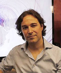
[Federica]: Welcome to a new episode of Technoculture. I'm your host, Federica Bressan, and today my guest is Maximilian Schich, an associate professor for arts and technology at the University of Texas at Dallas and a founding member of the Edith O'Donnell Institute of Art History. Maximilian holds an MA in art history, classic archaeology and general psychology from Ludwig-Maximilians University in Munich and a PhD in art history from Humboldt University in Berlin. Welcome, Maximilian.
[Maximilian]: My pleasure.
[Federica]: You first appeared on my radar when I stumbled across a couple of articles by you online, including 'A network framework of cultural history' (appeared on Science Magazine in 2014), and then I watched a video that also is associated to the work you described in this article, and the video is called 'Charting culture', and it was featured by Nature in 2014. What struck me about that work is how beautifully you bring together disciplines that already converge today (but not without problems), and that would be the arts and cultural history together with computation, natural science, and information design. The video is easy to retrieve online, but it is also linked in the description of this podcast episode, and I do encourage my listeners to watch this video because the animation is so well done, and I think that it speaks for itself, that it's really informative also in the light of what we're going to talk about today. And so what struck me is also that it was not just about mapping migration flows, for example, using data that is available - large sets of data - but how you associated those flows with how ideas spread, so with the cultural element which is always so elusive. So there is a lot to unpack there. Will you please tell us about how these disciplines come together, what the elements of this work are, and what kind of question the research tries to answer?
[Maximilian]: Yeah, sure. The project started from a dataset of 250 antiquarians moving from all over Europe, their birthplaces to Paris, Rome, and Dresden, and looking at that effect, we wanted to see how this looks for 100,000 people, which is related to the fact that at the point in time when I started the project, I was a postdoc in a network science lab where lots of people worked on human mobility, particularly using cell phone data. And so one of the big questions we had back then was, can we extend this into history? So what would be the signal of people moving from A to B? The essence of this was, obviously, first, to find out if we can use this paradigm, people moving from their birth to their death location. And here, it's very important to note why this is the decision, because most data we have on events in the life of persons, you know, the number of events we have for particular people in history are very sparingly. So on average, we have one or two locations per person, usually the birthplace, the place of death, in the West where you have Christian church records, we usually have the wedding, for some people we have some professional information, but for most people we literally have one or two events. So it's literally like we have, for every person where we have a birth location, for 15% we have a death location, for 15% of the 15% we have a third location. So whenever you work on biographies where you have a lot more data or points where people go from A to B, you basically restrict yourself to only the super, super, super famous, in essence. Right? So that's restricting just as much as to say, 'Oh, let's cut it off and just say birth and death location.' Why did we look at that? Birth locations are almost randomly distributed. That's because intelligence is not, or that's a hypothesis, it's not correlated with genetics - that's like how the data looks like - while death locations are very heavily correlated with where you're going. So if you're a professor, you're very likely to die at the location where you have your professorship, while if you're the captain of a ship, you're likely to die at sea or more likely to die at sea. And so obviously, this was the hypothesis going in, and this is how we started, and so the first thing we did was to say, 'Okay, we only have 120,000 people or individuals (noted individuals, not notable individuals) from freebase.com,' which is something like the database version of Wikipedia called Wikidata, only a little bit earlier collected by a company, but it was also available for free, covering all sorts of noted people. We had another dataset of 150,000 artists where we didn't have geolocations and another dataset of 20,000 artists where we had geolocations. So one of the first questions, of course, was, if we only have 120,000 people, are the patterns equivalent to what we would expect in demography? And this is actually what happens. So we can produce what demographers call Lexis maps, very basically record the death age over time or the typical how many people at a particular age, die and these pictures not only look like Lexis maps, which usually cover 60 to 200 years, but they look like Lexis maps, only we had data for 500 years where you could actually produce a sense-making picture. So that meant it actually works. And then from that moment onward, we switched our focus to locations. So our paper is not about the individuals. It's about the locations. So, you know, usual critique that comes is like, 'Yeah, but you can't do this because Picasso was born in this small Spanish place and then he died in the south of France, so you never captured this,' but that's actually not the point. Of course we see the Picasso effect because a larger number of artists dies in Paris because it's attractive because people like Picasso did hang out in Paris, and so that's an interesting thing. And we get another thing from Picasso, which is that people like to die in the south of France, you can totally see that. So one of the interesting things is that curiously, on a qualitative level, the data is very, very, very valuable. Right? So you can even break it down by neighborhood. If you go to a city like Berlin, you will see that the places where people die are the more attractive places, and the places where people are born and move out are the places which historically are not the nice neighborhoods.
[Federica]: You have observed, and rightly so, that if you're a professor, you're more likely to die where the university is, and if you're a ship captain probably at sea, or if you're an artist probably in Paris, but these things we expect, so when we see them plotted or animated, then we have confirmation of this, but we don't really learn anything new, so where is it that these animations, which sometimes today give us a 'wow' effect because they are impressive, what do they teach us? What potential do they have? Because this is an easy way to dismiss data visualization altogether. It's like, 'It's just pretty animations, but there's nothing new.' So what is the potential of using these types of animations to present data, large sets of data?
[Maximilian]: Yeah, so the visualization part is sort of something which we need to be super careful about, because visualization is not... You know the contribution is not to visualize something. That's a big mistake we do all the time. Right? That's also one of the big issues of data journalism, right? Just to show something doesn't mean you understand it. So I prefer to use visualization to think and not only to communicate, so the video, the famous video, is obviously a feat of communication, which, as you know, uses a very well-known kind of paradigm, which is, if you fly on an airplane, you open the map, the route map, that's exactly how it looks like, but most of the paper actually uses visualizations which are not so legible for a broader audience because they are actually targeted towards people who also write papers like this. And let me give you three examples for results that are non-intuitive and that are going beyond what, you know, regular humanists (which I am, in a different part of my life) would not expect like this. So one thing was the jump size distribution from birth to death location, which on average is about two to three hundred kilometers, and surprisingly didn't change over 500 years or 800 years significantly. So there is, yes, there is some difference. Obviously, once people jump over the ocean, there is a new characteristic length, and once people go all the way to Australia there is a new characteristic length, but other than that, there is no change, which means that globalization is more a matter of speed, not of distance. Right? So my favorite example is, my probability to die in Guam, south of Japan, is still the same, more or less, as for Saint Xavier or something, who really died there and was from Europe, and he did that in 1580 or something like that. Right? So that's one result. Another result would be the tail distributions, which actually turned out to be - and this is sort of an interesting issue - turned out to be safe distributions over quite a number order of magnitudes and evolved nicely so over time. So one of the strongest battles we had with peer reviewers was with complexity scientists from the area of urban scaling who assumed that the size distribution of locations in history should be an exponential with a parallel tail, so like a curved distribution with a straight tail. And we had these kind of really straight distributions, and so that was obviously a surprise, because otherwise, we wouldn't have had the battle with the peer reviewers. And so what happened to be the case was, they were actually working with a dataset which was collected by a humanist called Tertius Chandler (who, curiously, also believed in the Greek pantheon (Zeus and Hera and so on)) in the 1980s. So he did this list of 680 pages of size estimates for locations which has this curved distribution with a straight tail, and it turns out he sort of aggregated small places into large places, while we don't do that. We don't draw sort of polygons on the map. We take the actual points on the map, like Brooklyn stands for itself, New York City stands for itself, Manhattan stands for itself. This may sound weird, but if you do so consistently, it's more honest because you cannot take into account the geographic change in history, like U.S. counties, for example, sometimes move, you know, several miles, several hundred miles in some cases, over the map over time. They change state and stuff like that. So we didn't integrate it into locations, and we actually got over this peer-review battle in an interesting way because we had another dataset where smart librarians introduced questionable locations, so they had 'Moscow' and 'Moscow?' and these questionable locations have a higher probability if they're smaller, because if they're smaller, you have less data, so, you know, it's a higher probability for being questionable, so they had an inverse curve at the top, so it was disintegrated locations. So stuff like that is interesting. Another interesting thing is, we quantify the bias, so, you know, there's people looking at the video and say, 'Oh, there's all this Western bias and it's also all male.' Yeah, that's true, but we quantify the bias in the paper. It's the first, one of the first figures in the supporting material, it's the matrix.
[Federica]: I'm sorry to interrupt. Could you explicit what the bias exactly is? Is it just that the registries we have are from people from the Western world?
[Maximilian]: No, not only the Western world, but... So one interesting thing about the bias is... Obviously, every dataset has biases. Right? The first 10 years of my career, I worked as a sort of database pathologist and then switched to sort of data science, where I aligned my work with data with understanding art and cultural history. Before that, I sort of worked on finding out the problems of, only the problems of data, and from that experience, I would say about 50% of what you find out in data - if you're lucky - is bias, and you always need to take into account your biases. Like Max Planck said, if you look at the real world, you always have to be aware that your perception is biased by the measurement instruments, including your own eyes and obviously also the tools you use. And so in that data, one of the sources that leads to a lot of documentation of birth and death places is, obviously, that in the West in Christian areas in particular, you have these church books where birth and death are actually recorded. Right? Then the other thing is, you're more probable to be recorded if people in such a culture are interested. Right? So that's one of the reasons why even in Asia, a lot of people we have recorded are people who are either known in the West or Western people who went there, but then there is some exceptions, like, for example, Japan in about 1850 picked up certain traits of Western administration, including recording birth of death. And so that is an interesting kind of development, but we can quantify that now in relation at least for the last 30 years, we can literally see how does this compare to how many foreigners are actually in different countries? Right? Which we can figure out by looking at IP addresses, looking at, you know, all sorts of social, honest signals (as Sandy Pentland calls this), and obviously, there is many places which you don't expect. So what I experienced after the paper was published is that humanist professors, particularly in my home country in Germany, would complain about the fact that there is this Western bias while at the same time you got emails, and actually there was a tweet which was published by Nature two weeks later from a Chinese scholar who said like, 'Wow, that's awesome. Let's do this with the Chinese data.' And that is the first hint there is this data. Right? So there's things like in Korea, we have a whole dynasty where literally every word the king said was written down. There's ship records in the Persian Gulf. There's extensive records in the Caribbean about every person or individual that boarded a ship or an island with a bag of sugar or not. But then what doesn't go away, obviously, there is this gross inequality and asymmetry that, you know, obviously all the slave trade needs to be taken into account in a different way because the people who actually recorded demographic data about slaves were white racists. That's also true, of course, right? The same is true for the kind of male bias, which actually we had in the paper, but when we were accepted the editor said, 'You have to take out a third of the paper because there's not enough space in the journal.' So one of the... This is a very risky thing because you can't take out that stuff and then be rejected because you took out the wrong stuff, and because the editor sort of hinted there's other papers in there I thought, 'Okay, maybe the gender issue is another paper,' so I take that out, so I took out that figure out of the supporting material where the result would have been that there's actually a really optimistic message, which, yes, there is only 15% of females among the individuals over the hundreds of years, but the fraction is growing, the fraction of noted females grows exponentially at a the faster rate than the exponential growth of the system as a whole. So there must at some point be some crossover saturation taking place. And it's also interesting if you look locally, right? So one thing we found out is... So one of the most awesome places as an intellectual woman to hang out was probably Paris around 1630 where there were salons and stuff, and then once the court moved out to Versailles, that was sort of killed and then women returned not as social organizers, but they returned as artists, which is quite interesting. So you can see these kind of things. And then there's also things like, at certain points in time, certain locations seem to have been more favorable for particular types of people, including, you know, on your gender. So at some point, it was more awesome to hang out in Vienna than London, for example. And so these kinds of things are, I think, interesting to follow up. And indeed, the first paper that came out where people looked at this gender issue, then, with Wikidata, Wikipedia data (which is a logical follow-up), was, of course, the gender thing. Right? And I think that the title was like, 'Wikipedia is sort of a man's world.' It's not only edited by men, there is also more men in there. But that doesn't violate our approach of quantifying because all the stuff we show in the paper still holds. There is still the Zipf's and the Heaps' law, there is still the jump size distribution, there is still the high fluctuations at a local level, there is still (and this is the third result) one could talk about there is still a difference between highly centralized countries such as France, which, in physicists' word, undergo a so-called Bose-Einstein condensation. So 70% of all noted people in France end up in Paris, while in Germany no city ever makes it over 20%. So this is a stark difference, and that precedes absolutism, it precedes the federal organized structure of Germany. In some sense, obviously, it's in line with the kind of fragmented structure of Germany that precedes the kind of federal structure, but so it seems like that these kind of social organizations correlate, but there is no there is no simple causality between that organization and the actual political regime. And think about that. If you are in the European Parliament and you have to go home to your voting district, you have a completely different story to tell if you live in a country where since 600 years there is this super-high centralization, versus in your country, no city can ever make it over 20. So if Berlin gets a large airport, you can be sure there is five other cities competing with that, and that won't go away. You will never have a Paris in Germany because the other cities will just revolt.
[Federica]: Did you also come up with an explanation for this? I hear you so confident in saying that even in the future, you don't see this happening, we're not going to have the equivalent of Paris in Germany. Why is that?
[Maximilian]: So that takes us into this argument that in the sciences, the classic way to model the world is mathematical models. Right? So this is interesting to explain to humanists, I think. Scientists don't believe that these models are a fact or the truth or something like that, but they are a best version of it. Right? Like Richard Feynman explains this very well in a very concise manner, so you do a mathematical model that reproduces sort of the pattern you can observe in the world, and then you compare both the result of the model and the real world, and you can see differences which allows you to update the model. Obviously, if you look at a physics model, this may not tell you how biological organisms work, and a model of the interaction within biological organisms may not tell you how social interaction works. But one of the interesting things is, in addition to what could be called specific complications, which is what humanists usually sort of try to explain with hermeneutics in one way where you sort of always split up the problem and sort of get ever more specific, there is also (and this counters the idea of this classic two-worlds model of natural science versus humanities of nomothetic versus idiographic) - there is also something that is maybe not quite nomothetic, like a simple model of like, you know, how the molecules in the room, in the air of the room you're currently sitting in, behave, but there is something going on in the interaction of all these granular parts, and this is what's called emergent complexity. And the interesting thing is that this is something which is usually out of the discussion, even though it is there for a really long time, so not only complexity scientists like Warren Weaver have recognized that this happen, but also, you know, stellar humanistic researchers like Jane Jacobs have recognized this. She talks about cities are sort of the prime example of organized complexity, and nobody can deny this. Right? There is something going on in the organization of cities, there is also something going on in the organization of cities in space. Right? And so that is what we try to explain and go after, and if I say, 'Oh, yeah, you won't see a Paris of Germany,' that is rooted in the fact that there is a particular mathematical model, and obviously, there is no proof. It's just like in this particular case, you know - that's very important what I say here and what's written in the paper. In the paper, we probably phrased this way more cautiously because there's also this in-between state which is Great Britain, right, where there's a social season where you hang out in the countryside if you're wealthy and then half of the year you're in London. So obviously, there is a Paris, which is London, it takes in 39% of the people, I think, if I remember well, and then there is also a kind of, you know, spread out multi-centric kind of regime which sort of captures the other half of the year. And so in Great Britain you basically have a mixture of both like the model of Germany and France, or Japan would be another example. Right? Like Tokyo as the super center while there is also some multicentric activity. Italy, Rome is a super center while in northern Italy there is this multicentric competition going on. Belgium's really interesting multicentricity, really pure multicentricity, and we also know that from art market data, so all the cities sort of compete with each other. No city ever wins out. And then the golden age ends, like everything breaks down, and the whole thing starts up, and it has slightly different weights, but still you have this multicentricity. So it's really interesting that these things seem to be very, very, very stable, sort of governed by the evolution of the system, like once you evolved into a certain state, right, it's like if you have in a garden certain plants established, it's really hard to come up with a completely different regime if you don't rip out the entire garden, in essence. Does it make sense?
[Federica]: Yes. All these studies are allowed somehow by the availability of large sets of data. I would like to ask you to shortly define 'large'. I heard you mention a couple of hundred thousand records earlier on for birth and death places of these people, so how much data we need to talk about big data in this context?
[Maximilian]: Yeah, so what is big data? So what we work with is, I would say, large data, 'large' in essence takes a long time to look at it, takes a long time to study it, but it's still data. You can still, you know... I looked at every single record in this data. You can totally look at 120,000 images, which takes about two weeks if you look at 8,000 pictures a day, which takes you three seconds per picture, which is a moment, so that's feasible. Big data is if you have so much data that you have to throw away data. Right? Like at [the CERN 00:25:23], for example. But then it's not really hard to come up with big data even in the humanities. My favorite example I use for my students in visualization classes is that, you know, how long does it take you to produce a dataset of a million data points? Right? And then the lesson is to take out the camera and take a picture, which is a dataset with a million data points, if it's a decent [unclear 00:25:45] now you have five million data points in a regular cell phone. Another example would be the composer of the soundtrack of the Nature video, Tristan Perich, who's an amazing composer, he did a symphony called One Bit Symphony, and I think he published the first couple of seconds as a book, just zeros and ones, and it has 600 pages. So that's also something to realize that, you know, just a couple of seconds of recordings are already a really large set of data which can contain a lot of information. Right? And so in essence, 'big' is elastic with what you are comfortable with, if that makes sense. Right? So in general for the sciences, if you want to use the word 'big data', you probably should compare yourself what's big with the people you compete with. And I'm certainly not using big data because I'm not in the game of the CERN where I produce 40 million pictures at one gigapixel resolution per second. There is about, you know, maybe 50 to 100 million (that's an estimate) artworks on public, on the web in public websites, which is very big data compared to an art historian who may deal with, I don't know, you can totally write a book about one painting. Right? You could do a large exhibition about 200 paintings. So from that perspective, 100 million images is a lot of data, but compared with the fact that as humanity we upload a couple of billion pictures every day to social media, 100 million is probably not exactly large. It's not exactly big data for somebody working to just manage that data within say, you know, a large social media company or something like that.
[Federica]: We've ascertained that these studies are possible because data is available, and that means that it exists, and that it is accessible. I know that you're an advocate for the opening up of data and that you drew a parallel between what happened with the Human Genome Project when big data was opened up and people from all over the world could contribute to solving this riddle, and art history and visual resources that you wish could be opened up because a similar effect could be triggered, a positive effect. Can you explain this potential that you see deriving from opening data up?
[Maximilian]: I would like to divert this answer to the early World Wide Web, which, you know, which we celebrate the 30th anniversary today. Right? Or these weeks. Tim Berners-Lee sort of predicted that people who hug their data, who don't give access to their own website, who don't link to other websites, these kind of data and the websites will go out of business, and it's exactly what happened. So the people who stayed closed off, sort of nobody looks at them. Right? We look at Wikipedia; we don't look at the encyclopedias that people had to pay subscription of, something [like that 00:29:02]. Now, people may say, 'Yeah, but the Encyclopedia Britannica was curated and done by experts,' but you can sort of, you know, figure out with certain measurements that, yes, Wikipedia has a lot of trash in there, but so do encyclopedias that are written by experts. They are very incomplete and in such sense, you know, don't carry all the ideas that are possible to be carried. Also, research-wise, imagine if you are an expert in producing particular data, like collecting person data records, you may not be the same person or the same group of people who also comes up with the best research ideas. That's the power of having genome research, right, to have designers look at it, not just the one designer you are friends with, but many designers. So this sharing data sort of presupposes that you trust that humanity is awesome and there's lots of ideas and, in essence, the goodwill [unclear 00:30:01] also, right, because otherwise the data will be misused, maybe. But in essence, if you look at fields that share data, that made progress a lot, like astronomy has this culture since the 1980s, most of the discoveries, so to speak, are not done by people who stand in the backyard looking through the telescope. They're not done by the people who operate the billion-dollar telescopes pointing into the sky at the moment when they do the data acquisition, but they usually happen by people who sift through the data. And it very frequently happens now that, you know, people sit in their garage, and they download some astronomy data and they make an observation, and they publish that, and that's the result. And so I think that's the reason we need to share data. Another reason you could bring is, if you look at artworks, the value of artworks is obviously not tied to the rarity. So if you hide your Monet painting for 200 years in the free harbor of Geneva and nobody has ever seen it, people will be dubious if this is a Monet, right, or like they will be dubious if this thing somebody paid half a billion dollar for is really a Leonardo, while if it's always publicly viewable, that can acquire much more rigorous kind of scrutiny and may be much more solid. So the reason I am for sharing data is similar to what happened in astronomy and in biology, that it will actually make research more rigorous, it will nurture research you couldn't even think about. Because, you know... Favorite example: in Boston, the Massachusetts Transport Association published a stream of data, like all the GPS locations of all the trains and trams and buses, and so they couldn't afford to put up a signaling system, because they were like too cash-strapped, but as they put up that stream - which they already had, right? So they knew the GPS location. There was a server that had that. They basically just opened the port and exposed it to the public, and because it was Boston, within six weeks there were five to eight apps that were built by students and by practitioners in the public which you could download on your cell phone and then you could stand at a bus station and you could actually see when the next bus will arrive. People have done new awesome subway maps and stuff like that. So that is something which can only work if the data is actually available, and if the data is not available, you always throw back to the so-called experts, which may not be expert. They may just hug their data and keep their job. Right?
[Federica]: I have one last question for you, and that is about the future, a vision for the future. If you agree that it is fair to say that we are at the dawn of a new era for research and knowledge production because more and more large datasets will be available, would you also say that we are about to see a virtuous circle between the advancement of knowledge and methods and the technology? And is this virtuous circle maybe the hypercycle that you mentioned in one of the online articles that I found on Edge.org, to be specific from 2016, when you were asked, 'What do you consider the most interesting recent scientific news and what makes it important?' and you answered talking about the hermeneutic hypercycle, which blew me away, by the way, and I know that it would be worth more than a five-minute answer, but please try.
[Maximilian]: Yes, so I came up with a little concept which sort of makes the premise that the hermeneutic circle, meaning you look at the specific with the general in mind and then you make generalizations based on lots of specifics, which is the hermeneutic circle, the so-called hermeneutic circle, in the humanities, and what I argue is that through quantification, like now that we have, we can not only qualitatively look at large data collections, we can also quantify them, which allows us to do mathematical models, which allows us to change the data model, which allows us to collect ever more data in a different way than a humanist doing qualitative research doing a publication which may never be picked up by whatever official body actually governs the data model, ISO standard, of a particular field. So now we have sort of short-cut that. Right? So particularly in large-scale corporations and large-scale research institutions where the feedback loop is there, right? So if you're at the Library of Congress and you, for example, you have the full text of all the books, you can calculate the actual structure, which may be different from the library classification based on linguistic analysis, which may lead to a different sort of catalog structure, which may lead to more efficient research because people figure out how this field has really to do with this field, only they use a different language, because I can see the overlap. So that is something which will accelerate the system, much like the citric cycle in the human cell accelerates in the presence of fuel, much like the carbon cycle in the sun in the presence of fuel sort of accelerates the reaction. And so in that way, for those who are a little bit familiar with systems biology, I think what's going on in the humanities is not that we were missing the accelerating factor. We actually have too many inhibitors. So there's this culture of, 'Yes, but' will go away not in the humanities, but by people who ask cultural and humanities questions, and if the culture of 'Yes, but' resists that kind of thing, it will just happen in information science departments and companies in the public view by people who do that, you know, with different sources of funding. But let me say one thing. The inhibitors are not only a bad thing. Like in every biological system or every ecological system, you need also inhibitors, but they need to be informed inhibitors, cannot just be, 'Oh, you know, this quantification's really evil.' Sometimes you need to quantify to actually see what kind of quantification is evil. Right? But given the situation we are in right now, this radical asymmetry where you have certain stakeholders that have all the data while others have nothing - like, you know, if you just go on the web and browse, there are certain people who give you advertising that know more about you that you do yourself -obviously, this kind of asymmetry can only be mitigated if we know how the system works, and figuring out how the system works will not be solved with qualitative theory, I'm pretty sure. We have to actually look at the system because otherwise, it's similar to sort of patronizing ex cathedra while not looking at the body that's dissected below your actual chair from which you read your book that may be hundreds of years old. We actually need to look at the actual body of data.
[Federica]: Thank you so much for taking the time to be on Technoculture. I definitely encourage the listeners to watch this video called 'Charting culture'. It's available on YouTube and linked in the description of this podcast episode. And congratulations for the important achievements in your career. Thank you so much.
[Maximilian]: Thank you very much.
[Federica]: Thank you for listening to Technoculture. Check out more episodes at technoculture-podcast.com, or visit our Facebook page @technoculturepodcast and our Twitter account, hashtag Technoculturepodcast.
Page created: March 2019
Updated: September 2019
Update: September 2020
Update: October 2020
Last update: September 2021